Weir Motion Metrics
See prototype
Improving data analysis and decision-making for mining teams through UX research

Company
Weir Motion Metrics
Date
August 2025
Contributions
Product Design, UX Research, Wireframing, Rapid Prototyping
Team
1 Designer, Data Integration Specialist, Director of CLD
Introduction
My time at Weir Motion Metrics
Weir Motion Metrics develops AI-powered monitoring solutions for the mining industry. As a UX/UI Designer on the Cloud Team, I collaborated with product managers, developers, and domain experts to improve MotionMetricsPro (MMPro), the company's cloud platform for mining operations. My primary focus was redesigning the Fragmentation Monitoring module experience.
Project Context
The ask: Improve the Fragmentation Monitoring experience for mining engineers
Fragmentation Monitoring is a module within the cloud platform which helps engineers assess blast performance by analyzing rock-size data. This module was identified as a strategic area for improvement because adoption remained low.
The existing Fragmentation Monitoring module
Why this project mattered
Fragmentation affects every stage after blasting. Since rock breakage can account for 30–60% of a mine’s energy use, monitoring rock size helps engineers evaluate blasts and improve downstream efficiency.
Source: Hosseini et al. (2022), Resources Policy.
What was I asked to do
The initial request focused on improving the existing data visualizations so engineers could interpret fragmentation results more clearly without compromising system performance.
How does Fragmentation Monitoring work?
The first step was understanding how Fragmentation Monitoring fits within the mining process. It is a tool that measures the size of rocks produced by a blast, helping engineers evaluate the results and understand how the material may affect later processing. Here’s how the process works:
Step 1: Blasting
Engineers use controlled blasting to break rocks into smaller fragments for loading and processing.
Step 2: Loading & measurement
Shovel cameras capture rock images, which get uploaded to the cloud platform for rock-size measurement.
Step 3: Downstream processing
The measured rock size helps engineers assess blast quality and anticipate its impact on crushing and processing.
My contribution to the project
As the UX/UI designer leading the project, I led discovery through stakeholder interviews, customer feedback analysis, a product audit, and competitor research. I translated these findings into a site-wide workflow redesign, new data visualizations, and high-fidelity prototypes in collaboration with Product, Engineering, and Customer Success.
Preview Snapshots


User Research
User Interview & Survey
Understanding why customers weren't utilizing Fragmentation Monitoring
Wanting to understand the primary reason why Fragmentation Monitoring had low adoption, I interviewed the Customer Success Manager who supported a global customer base day-to-day and surveyed 6 internal members across sales, support, and quality roles. My findings were:

Screenshot of Power BI dashboard
Current experience supported investigation, not discovery
The existing experience was being used to inspect an issue the user already knew about; it didn't help them identify emerging problems.
Customers relied on external tools
Users exported fragmentation data to tools like Power BI because MMPro didn’t provide the comparisons and summaries they needed.
Selected quotes from user survey
Users wanted to compare trends across shovels
Unified charts were missing, which would make it easier to compare fragmentation trends and identify differences between shovels.
Fragmentation data wasn’t linked to location
Without location data linked to fragmentation results, customers relied on timestamps to estimate where the material was collected.
Competitor Research
Taking a look at how adjacent fragmentation tools were displaying data
To better understand the fragmentation analysis space, I conducted a competitive review of Maptek, Strayos and Orica's software tools. I focused on how these tools presented rock-size data across blasts, locations, and time.
Maptek PointStudio
Uses 3D point-cloud data to measure and map fragmentation across blast surfaces.

Connect fragmentation results to specific blasts & locations for clearer spatial context.
Design Takeaway
Tracks fragmentation results blast by blast
Maps rock-size distribution across 3D blast surfaces
Analyzes 3D point-cloud fragmentation data
Key Capabilities

Pair visual rock-size maps with charts and summaries to interpret patterns more easily.
Design Takeaway
Strayos Fragmentation AI
Uses AI and site imagery to create 3D mine models and analyze fragmentation.
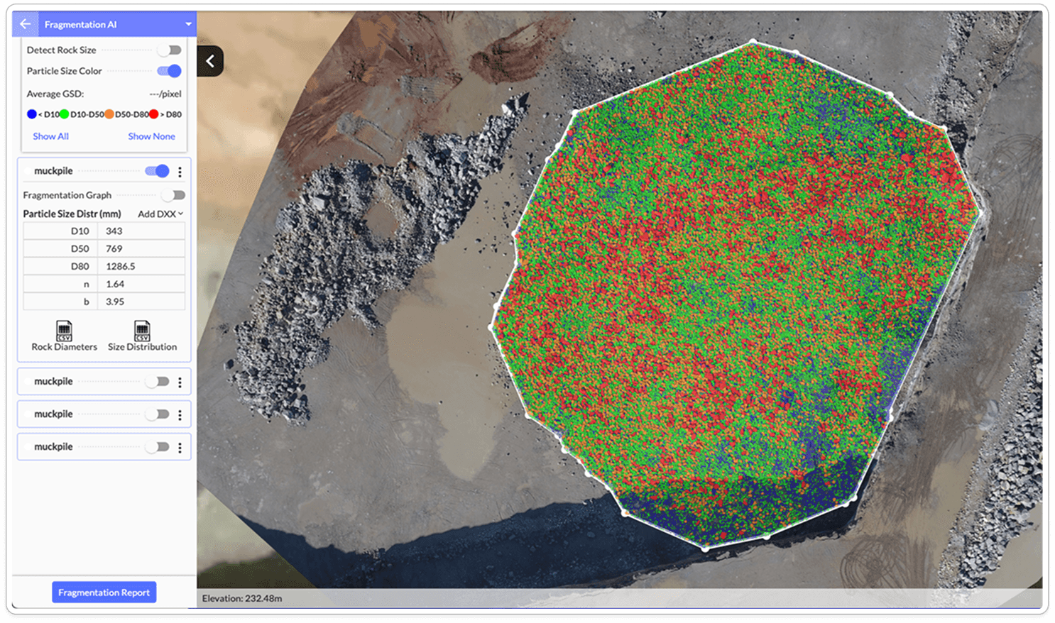
Provides fragmentation charts and summaries
Maps detected rock sizes across muckpiles
Exports rock-size data and reports
Key Capabilities

Orica Blast IQ
Connects fragmentation measurements to blast locations and performance trends.

Combine spatial and temporal views to show where and when fragmentation changed.
Design Takeaway
Maps fragmentation results across blast areas
Plots changes over time and PSD trends
Supports configurable metrics & thresholds
Key Capabilities

What was the big takeaway?
Across these tools, fragmentation data was organized around blasts, locations, and trends, not individual equipment alone. This reinforced the opportunity to pair its shovel-level measurements with broader context to compare performance before beginning a detailed investigation.
The Problem
Discovered Problem
Engineers could only inspect individual shovels and not understand the overall performance
The current flow begins by selecting a shovel, then reviewing fragmentation data and bucket images for that single piece of equipment. While this worked well for investigating a known issue, it made it difficult to understand how an entire blast performed across the mining site.

Current Fragmentation Monitoring screens
The direction of the project was redefined from the initial design brief
Research revealed the challenge wasn't just the existing charts, but also the workflow that prevented users from understanding performance across an entire site. What began as improving existing visualizations evolved into rethinking the entire fragmentation analysis workflow.
Improve existing visualizations
Refine the fragmentation charts
Make results easier to interpret
Maintain system performance
Initial scope defined in the project brief
Redesign the analysis workflow
Compare performance across the mine site
Surface patterns and trends
Support site-wide evaluation to shovel-level investigation
Direction informed by research findings
Refined Design Challenge
How might we redesign Fragmentation Monitoring to help mining engineers understand performance across the mine site?
Design Process
Workflow Exploration
Mapping refined user flow that moves beyond shovel-level analysis
Gathering findings from my research and iterating based on feedback on user needs and feasibility, I mapped a flexible workflow that allowed engineers to monitor recent performance, compare shovels and blasts, and investigate detailed measurements and images.

Exploring The Problem
Making recent shovel performance easier to assess at a glance
Engineers first needed to determine which shovel required investigation. Early dashboard explorations emphasized detailed fragmentation metrics, but comparing multiple shovels quickly became overwhelming. I shifted the focus to 24-hour trend summaries that supported faster assessment.
Existing Experience

Latest bucket images lacked recent performance context
Each shovel card showed its latest bucket image. The image alone did not show how fragmentation had changed over time.
Design Exploration

24-hour trends surfaced recent performance changes
I replaced the bucket image with a 24-hour trend summary, allowing engineers to scan recent performance against the target line.
Enabling site-wide performance comparison
After identifying which shovels required investigation, engineers needed broader context across the operation. I explored an Overview page that brought selected shovels, blasts, and locations together for site-wide comparison.
Existing Experience

Analysis was limited to one shovel at a time
Engineers had to open each shovel separately and mentally compare its results, making broader patterns difficult to identify.
Design Exploration
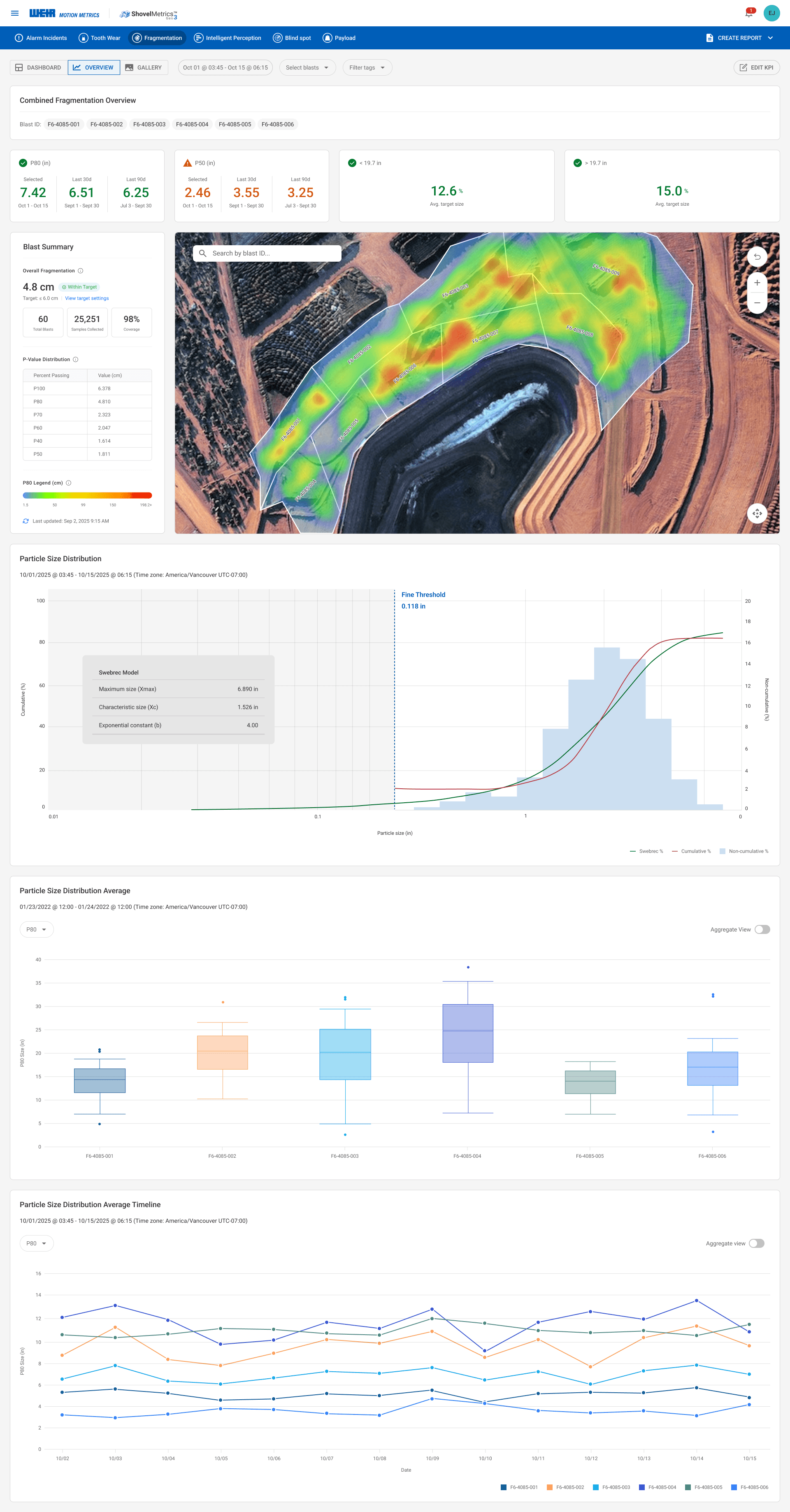
A unified Overview enabled site-wide comparison
I introduced an Overview page where engineers can compare fragmentation measurements across multiple shovels and blasts.
Making large image datasets easier to navigate
Engineers used bucket images to validate fragmentation results, sometimes reviewing hundreds from a single shovel. The existing Gallery loaded the entire image set at once, resulting in slow load times and extensive scrolling.
Existing Experience

The entire image set loaded at once
All images from the selected time range appeared in one continuous gallery, resulting in very slow loading and lengthy browsing.
Design Exploration

Loading only the images engineers needed
A shovel menu made it easier to switch equipment, while collapsible day groups loaded images only when opened.
Data Visualization Exploration
Finding the right way to communicate fragmentation patterns
The Overview needed to summarize thousands of shovel measurements without hiding meaningful variation. I explored different levels of aggregation and chart types to help engineers compare distributions, track changes over time, and investigate individual measurements.

Each dot represented more than a single measurement.
(fragmentation data + bucket image + metadata)
Existing Visualization


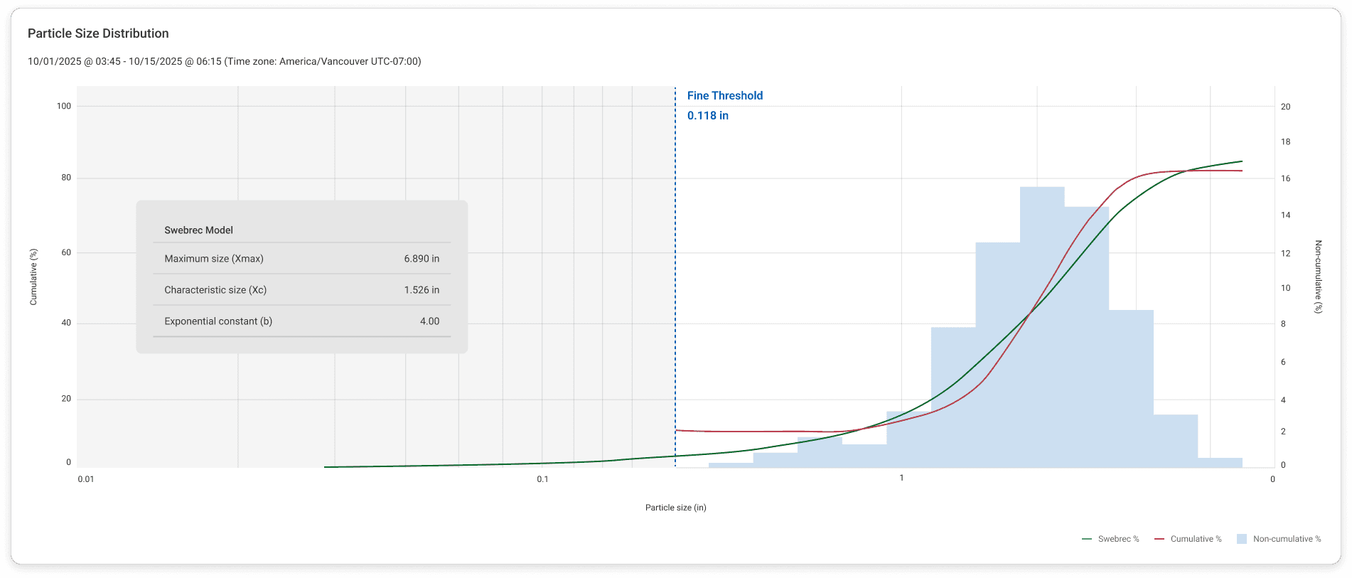
New Visualizations
Constraints
I had to design an experience that worked across different customer environments
Engineers ideally compare fragmentation by blast and location. However, not every customer integrated this information into MMPro. I designed the Overview to support blast-based analysis when that context was available and shovel-based comparison when it was not.
CUSTOMER A
Blast data available
Available Data
Blast ID
Blast location
Shovel Data
Fragmentation Data
Blast-based Overview
Compare performance by blast across the site.
CUSTOMER B
Blast data unavailable
Available Data
Blast ID
Blast location
Shovel Data
Fragmentation Data
Shovel-based Overview
Compare shovel performance when blast data isn’t available.

Blast-enabled Overview

Shovel-only Overview
AI-Assisted Exploration
Leveraging AI to accelerate exploration and iteration
As the project expanded from a minor visualization update into a full module redesign, I used Microsoft Copilot to explore workflows and chart concepts more quickly, and Figma Make to turn promising ideas into interactive high-fidelity prototypes. These prototypes helped stakeholders and engineers understand the intended interactions, component behaviours, and workflow logic before development.
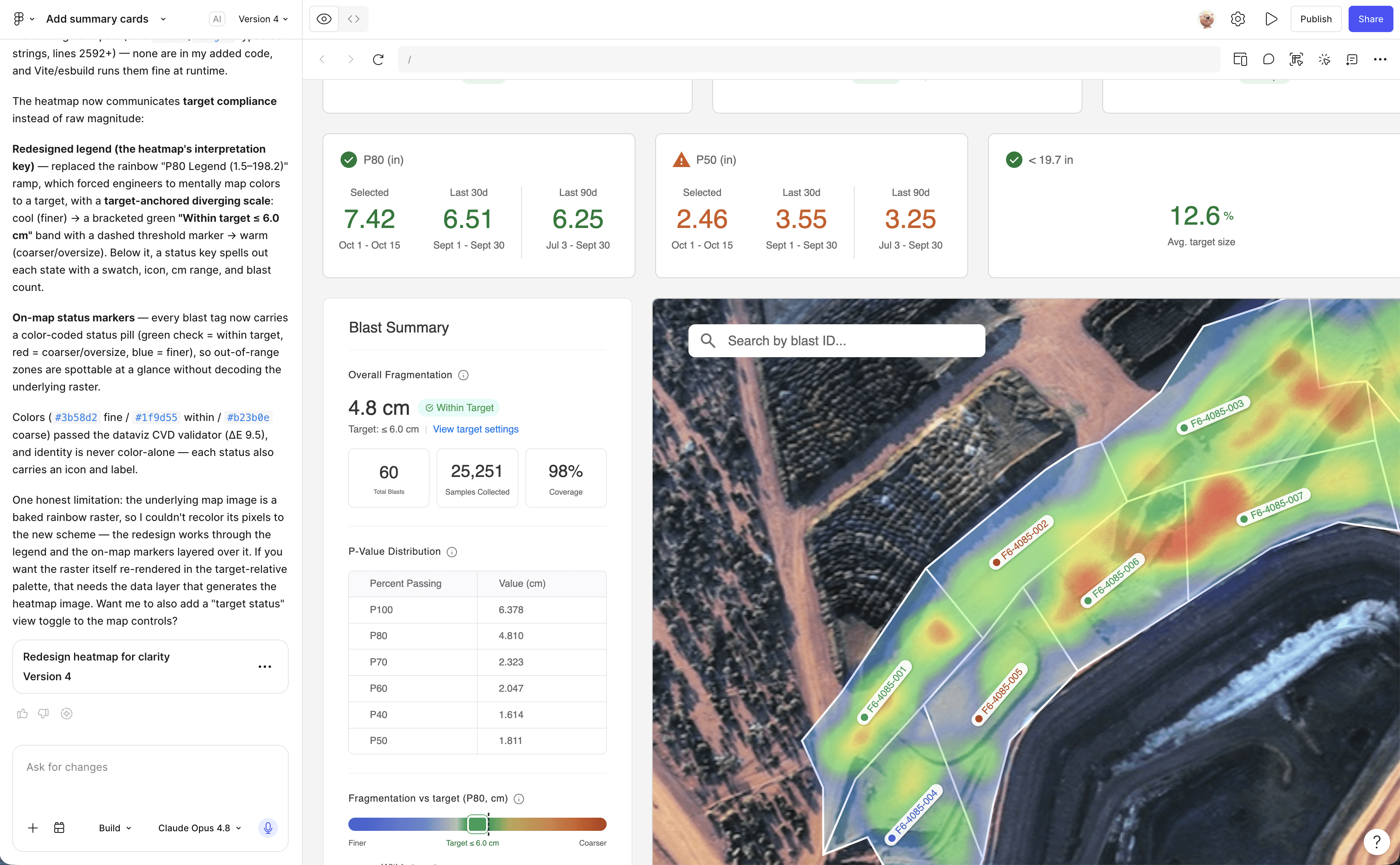
Proposed Experience
Final Screens
From site-wide monitoring to focused investigation
Conclusion
Reflection
What I learned 1/2: Designing for enterprise software isn't about showing more data
This project taught me that simplifying an interface doesn't necessarily mean removing information. Often it means understanding when users need information and presenting it progressively throughout their workflow.
Working with engineers, product managers, and customer success also reinforced how user research, technical constraints, and business priorities all shape design decisions. Rather than optimizing individual screens, I learned to redesign the workflow as a connected system.
What I learned 2/2: Growth through ambiguity
This project and time at Motion Metrics marked an important chapter in my growth as a designer. While my time on the team ended unexpectedly due to a layoff, the experience was both bittersweet and formative. It reinforced how much I enjoy stepping into new learning curves, quickly building context in complex domains, and developing a genuine curiosity for the problems I'm solving.
And More
My other contributions beyond Fragmentation Monitoring
During my time at Weir Motion Metrics, I contributed to improving MotionMetrics Pro across product, design, and system-level initiatives.
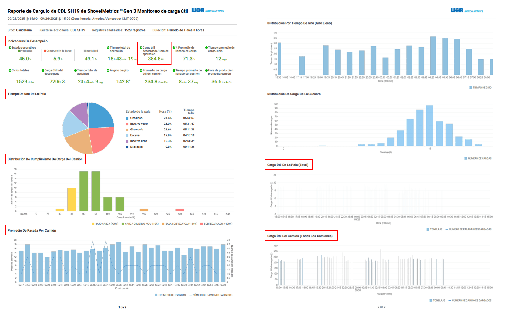
Spanish translation project
Ensured UI consistency across translated strings by identifying and resolving layout, truncation, formatting.
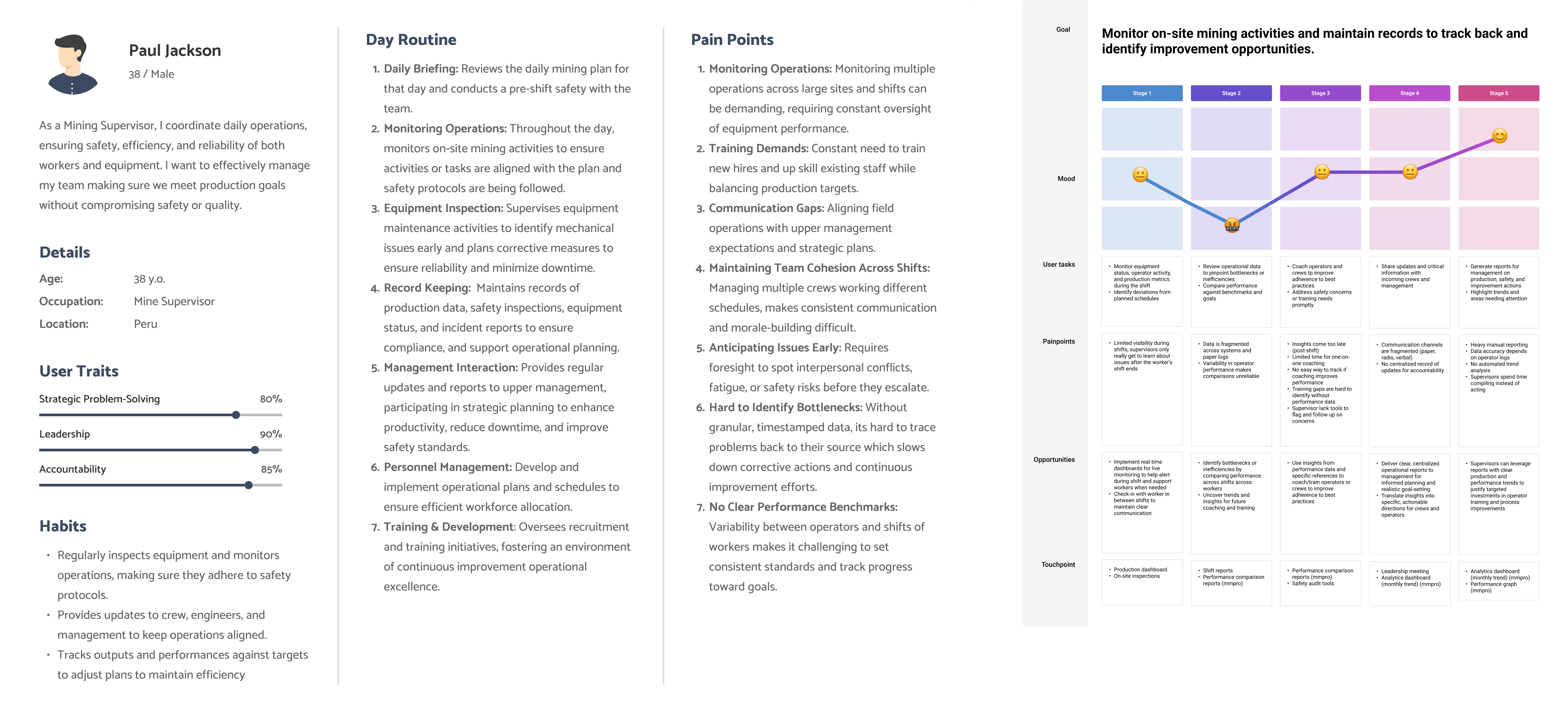
New feature brainstorming
Translated product requirements into early user flows, wireframes, and personas for new feature directions.
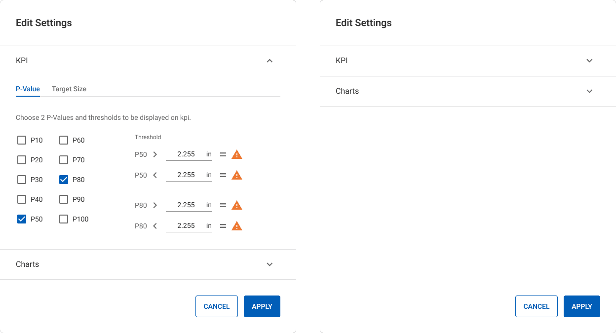
Design system components
The team was restructuring the design system, and I supported creating new usable components.