La Bâtie Festival
See prototype
Extending La Bâtie’s visual identity into a post-event artist discovery experience
Client
La Bâtie - Festival de Genève
Date
March 2024
Contributions
Visual Design, Art Direction, Interaction Design
Team
5 Designers (Raymond C, Lori J, Angela L, Christy F)
Introduction
Ever left a festival wanting to discover more?
A performance stays with you. Maybe you discovered an artist for the first time, became curious about their work, or wanted to revisit a moment you experienced. Even after the festival ends, that curiosity continues, leaving you wanting a way to explore the artists and stories behind it.
Project Context
Introducing La Bâtie - Festival de Genève
La Bâtie is an annual 18-day multidisciplinary festival showcasing national and international artists through 50+ events across 40 venues around Geneva. Its program spans theatre, dance, music, live performance, and more.

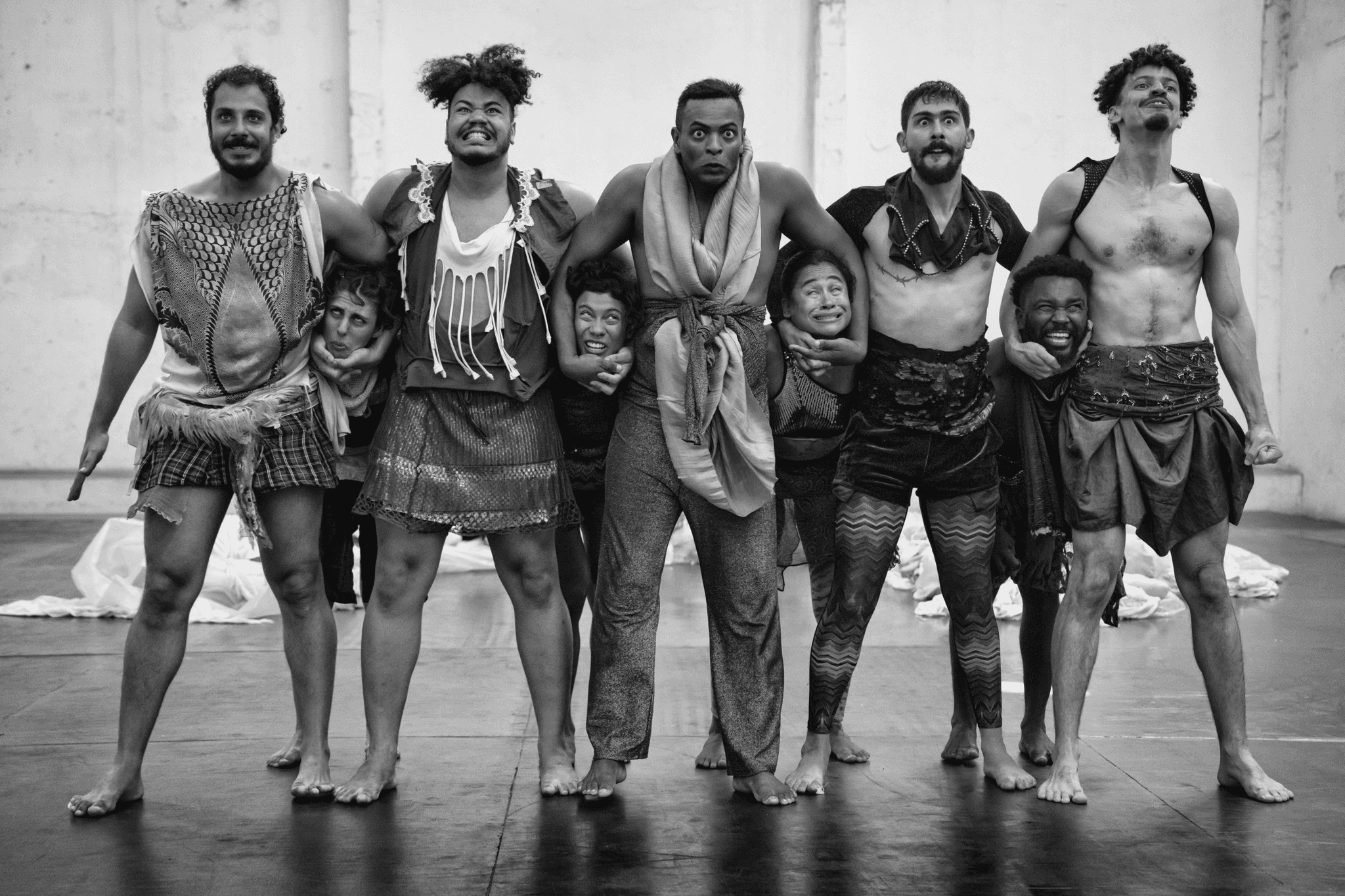


La Bâtie performances
The opportunity
To extend La Bâtie’s identity beyond the festival and create a more meaningful way for audiences to discover and connect with its artists.
My contributions
Within a five-person team, I translated principles from a precedent designer into a distinct visual and interaction direction, carrying it from graphic experiments into physical assets and the final microsite.
Preview Snapshots
Introducing the interactive grid through motion
Incorporated the La Bâtie logo into a tile-sliding animation to have an engaging introduction, building anticipation for the dynamic grid-based interactions.
Exploring La Bâtie’s festival genres
Organized festival genres into interactive tiles, using a background video montage to preview artists and performances throughout the program.
Discovering artists within each genre
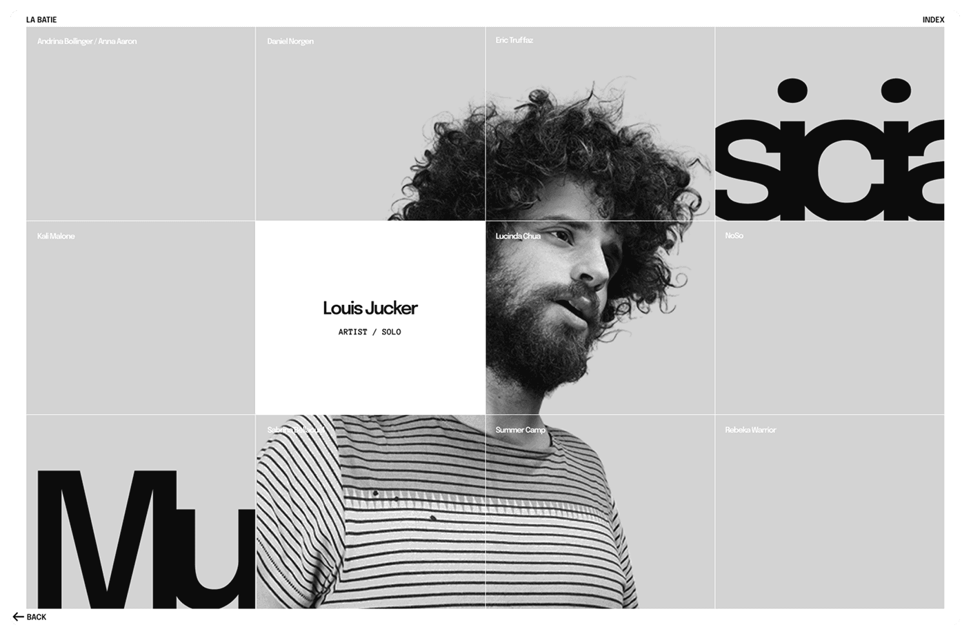
Displayed artists within an interactive grid, revealing their portraits on hover to create a playful and immersive discovery experience.
Exploring each artist’s creative practice
Adapted the grid into three sections: Biography, Creative Process, and Artist’s Pick—to reveal the stories, practices, and influences behind each artist.
The Problem
Limited Artist Context
Artists were introduced, but rarely explored in depth
With more than 40 productions across diverse disciplines, La Bâtie introduced audiences to many artists. However, the current festival website provided limited context about their backgrounds, creative processes, and wider body of work.
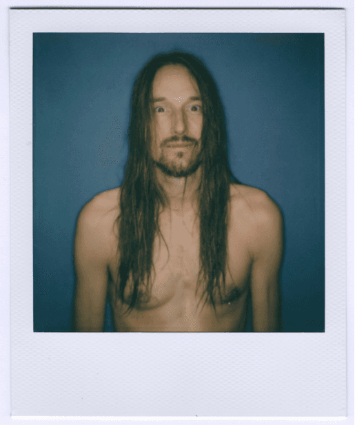
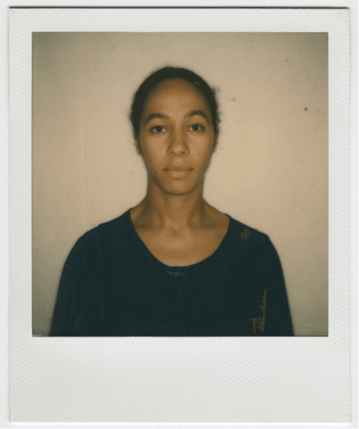
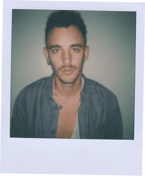
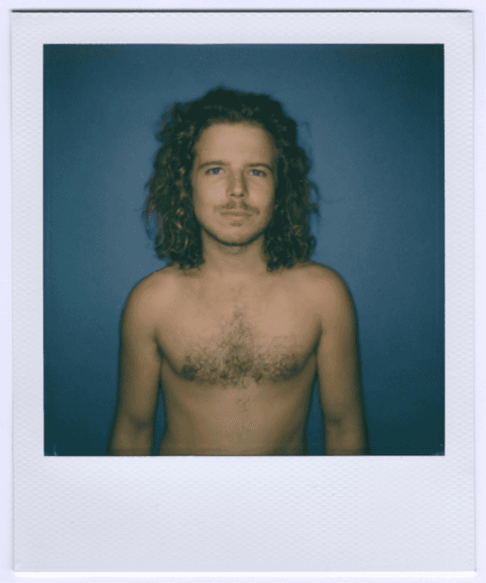
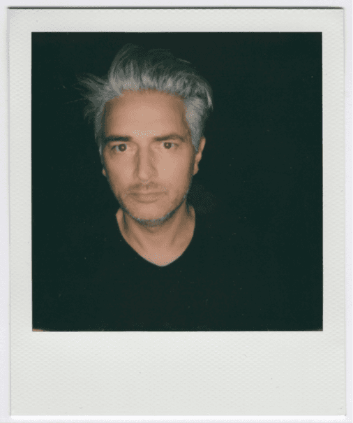
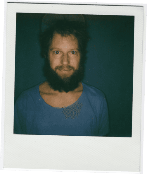
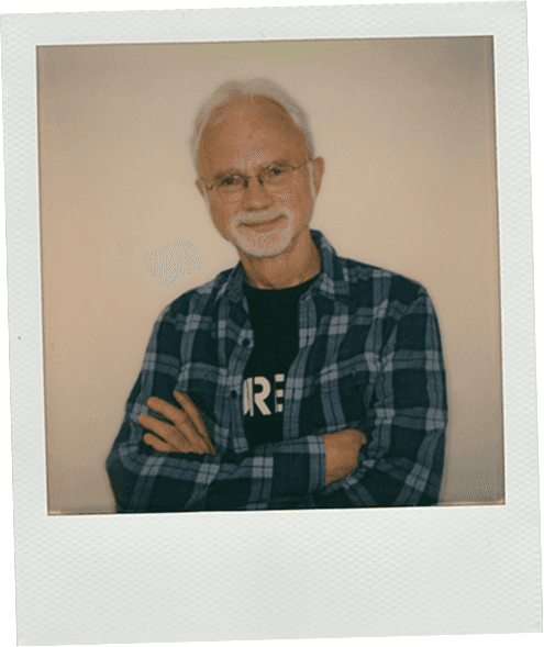
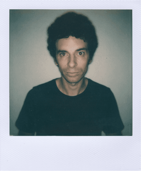
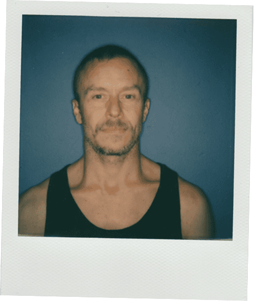
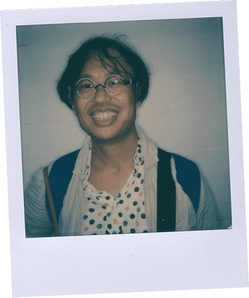
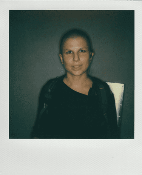
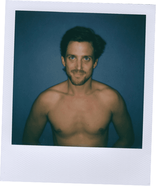
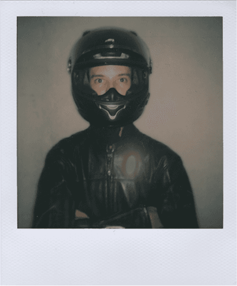
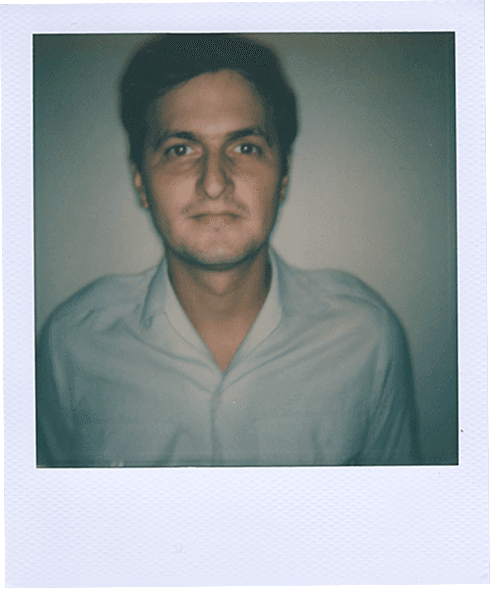
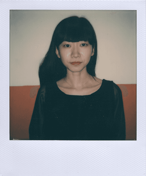
Polaroids featuring La Bâtie artists

Artist detail page on La Bâtie website
Design Opportunity
The digital experience ended with the festival
The website primarily supported schedules, event information, and ticketing. After the festival, audiences had no dedicated way to revisit artists or continue exploring their work without searching for them across external platforms.
Design Challenge
How might we help audiences discover La Bâtie’s artists more deeply and continue exploring their work beyond the festival?
Art Direction
Our Approach
A process centered on visual identity and storytelling
Unlike a typical UX project, this one prioritized defining the tone, content, and artistic direction first, then shaping interactions around it. The process moved from framing the core problem to exploring visual directions and finally refining how the experience comes to life through interaction.
Content Design
What stories are actually worth telling?
Fans may already know artists through their music, but what do they never get to see? We curated three content pillars that would take people somewhere new: the biography behind the artist, the process behind the music, and the personal world behind the persona.
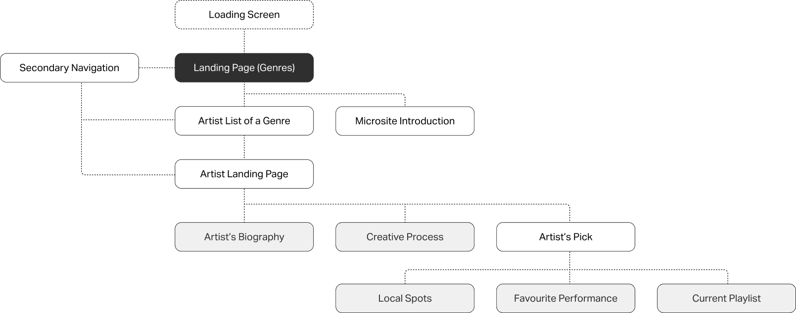
User flow - Structured the site around the artist as a person, not just a performer
Brand Direction
Using precedent analysis to guide our experimentation
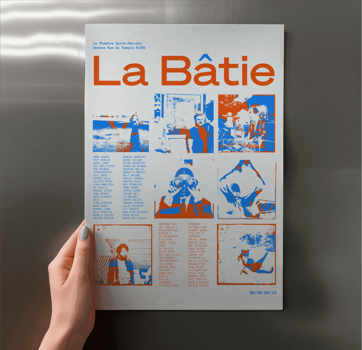
To begin shaping La Bâtie’s visual identity, our team was assigned Experimental Jetset as a design precedent. We grouped and analyzed examples of their work to understand the decisions behind their visual language, identifying three qualities that would guide our own graphic experimentation.
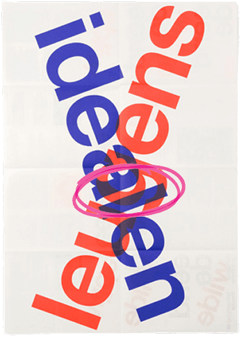
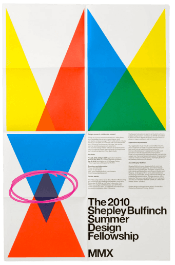
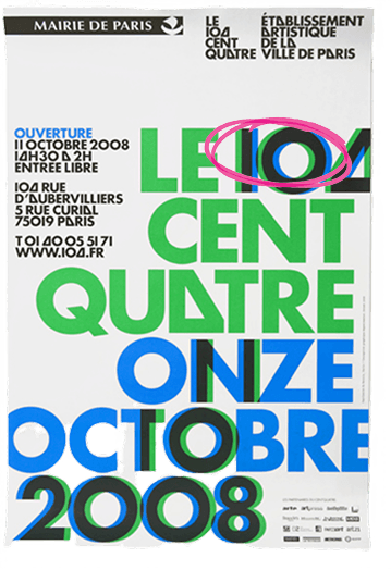
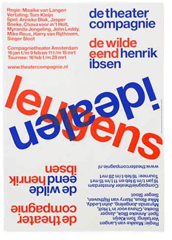
Overprinting - to create depth and visual harmony
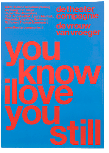
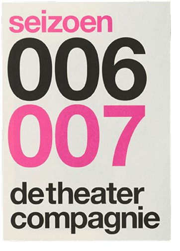
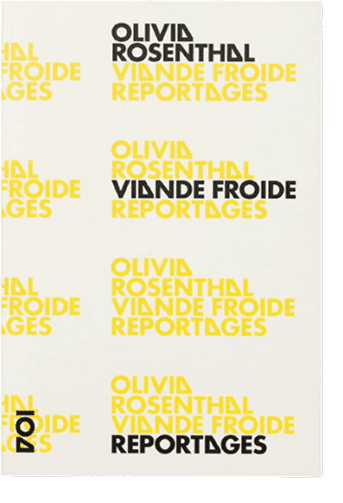
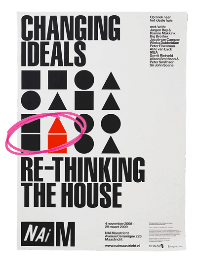
Two-tone palettes - to create strong visual contrast
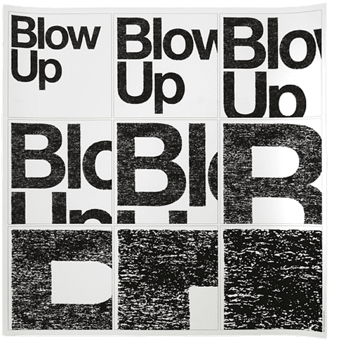
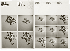
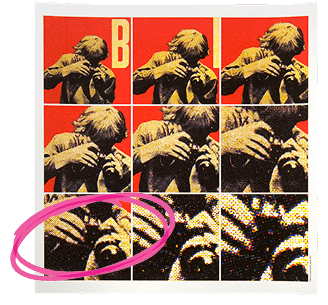
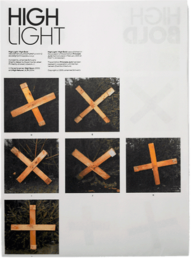
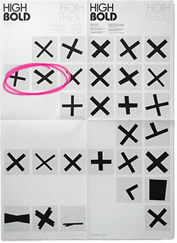
Repeating imagery - to create rhythm and cohesion
Experimenting with different directions within a shared system
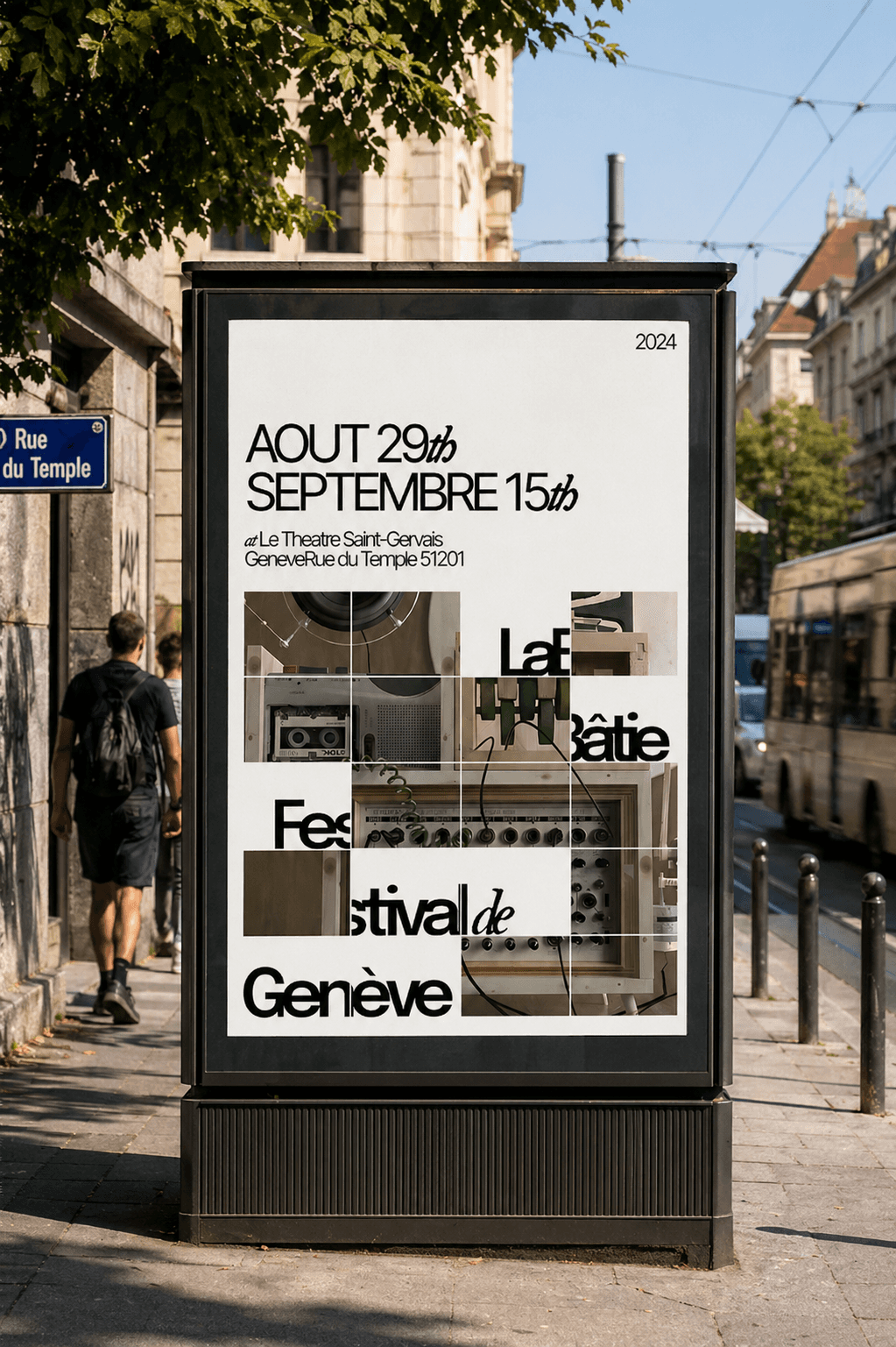
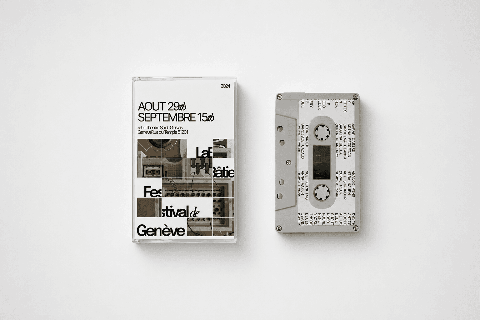
We took the three design qualities and deliberately pushed them in different directions, not to find the "correct" one, but to understand the range. They were translated into graphic assets across the city to see if it remained flexible enough to extend into a digital experience.
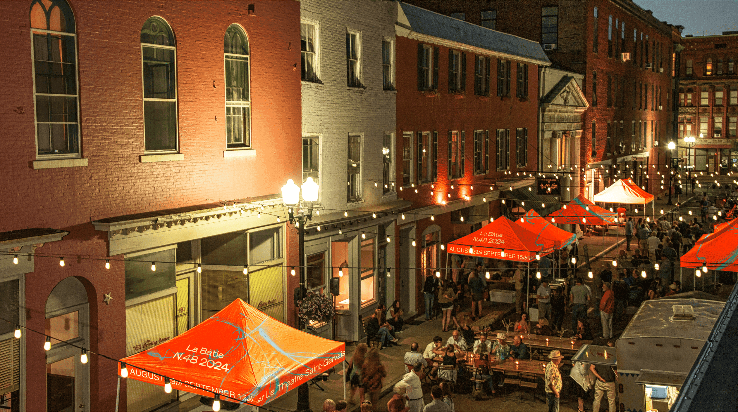
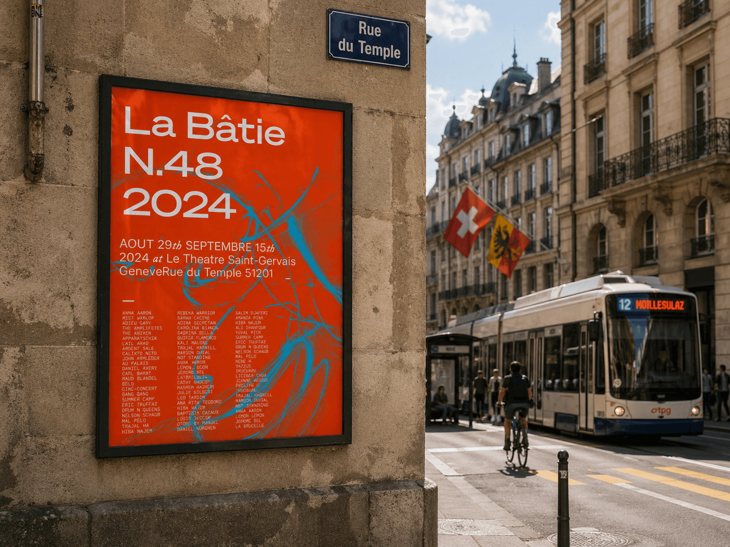
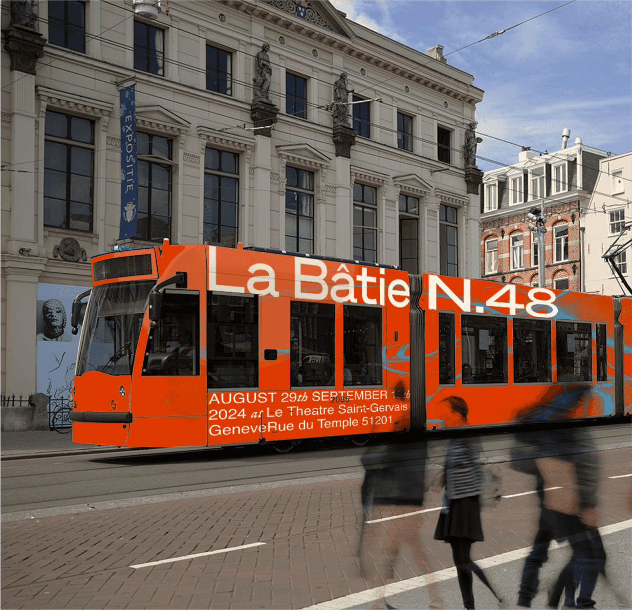

Art direction 1
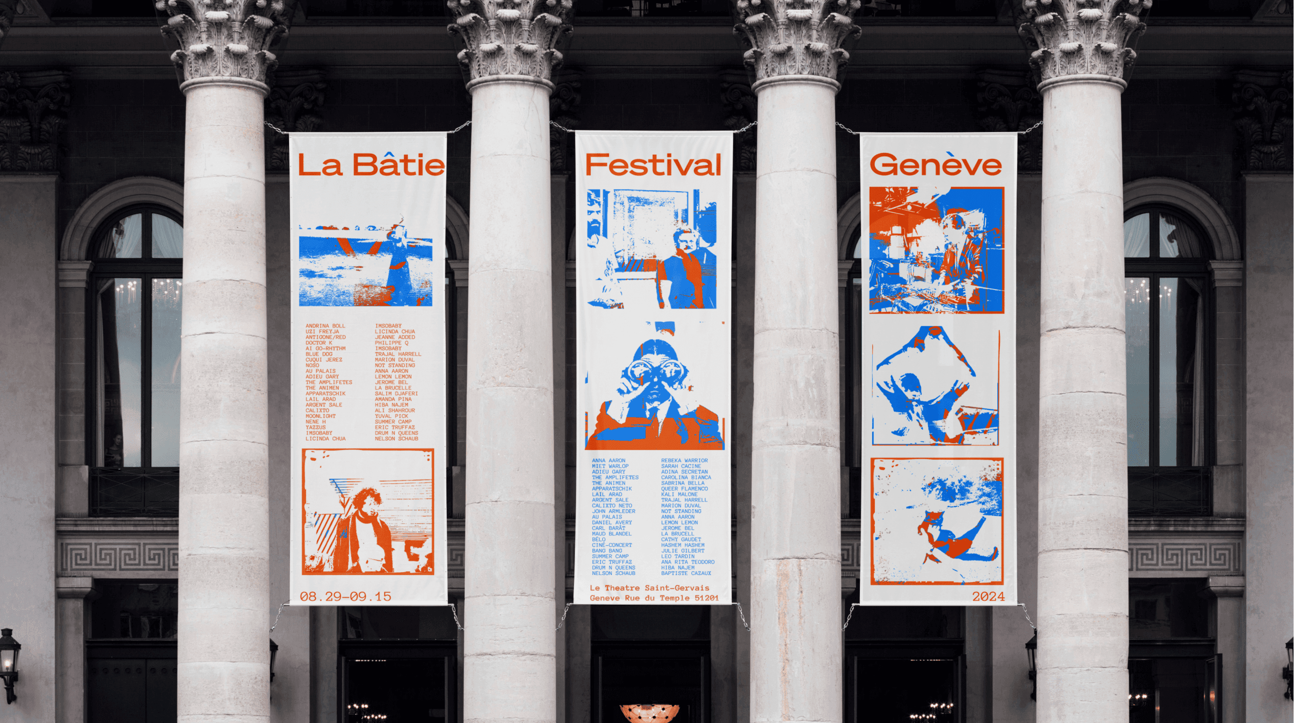
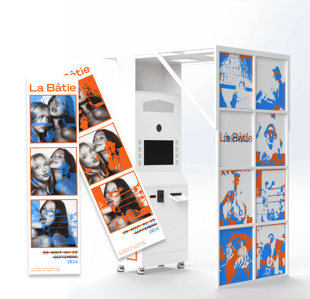

Art direction 2
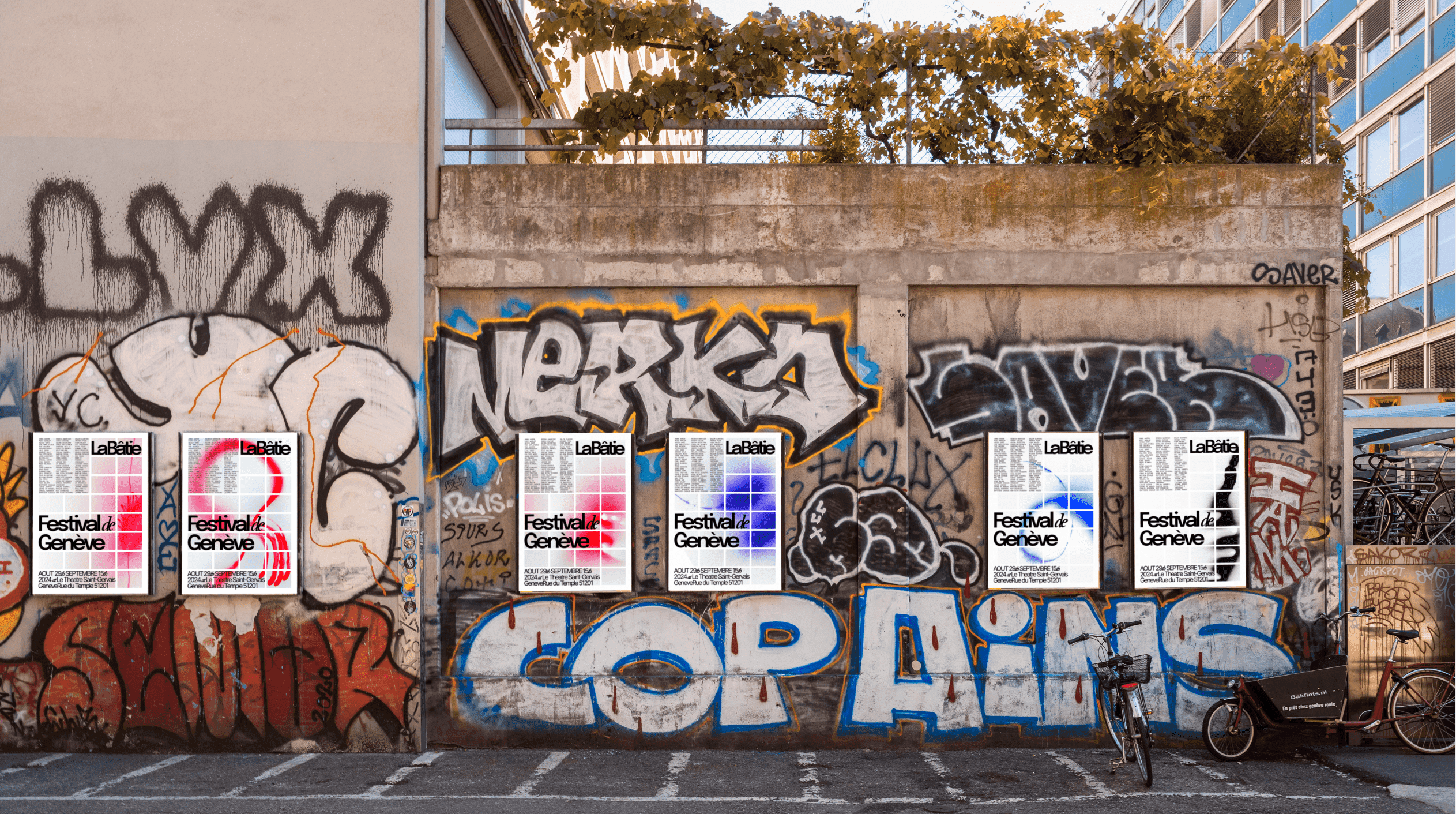
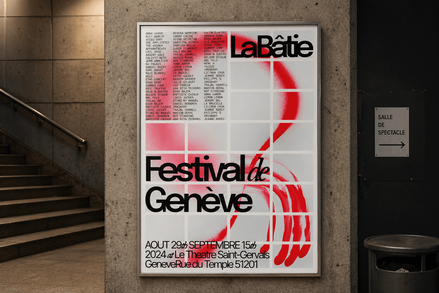
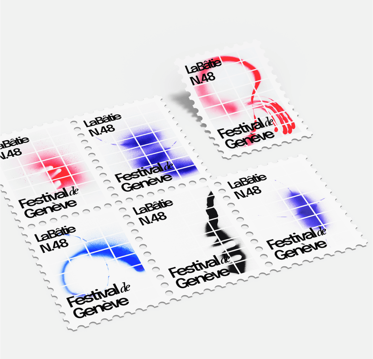

Art direction 3
We didn't choose one direction, we listened to all three.
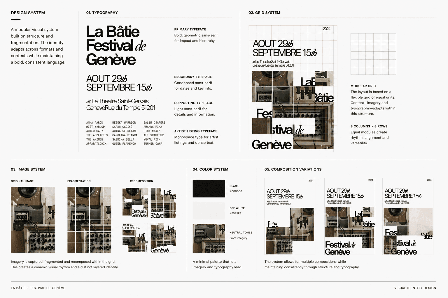
After feedback, it became clear that the answer wasn't sitting neatly in any single direction; it was scattered across all of them. We gathered the strongest design elements and made adjustments to create the final iteration.
Interaction Design
Microsite Explorations
Translating the visual direction into interaction
With the visual system and content strategy established, we explored how they could shape the microsite’s navigation and interactions. Three concepts tested a spectrum from structured, content-led layouts to more expressive and exploratory experiences.
Version 1 - Structured and functional
Version 2 - More expressive
Version 3 - Most expressive
Prototyping & Iteration
Developing the grid into a connected experience
After selecting the grid-based direction, we explored how it could adapt across the full journey—from choosing a genre and discovering artists to exploring an individual artist’s work. Reusing the tile system across each page created a consistent visual and interaction language.

Figma final prototype project page
Final Microsite Screens
From the visual system to the digital experience
With the visual system and content defined, we had to figure out how it translated into interaction. We explored three different directions, ranging from structured navigation to more expressive, exploratory experiences.
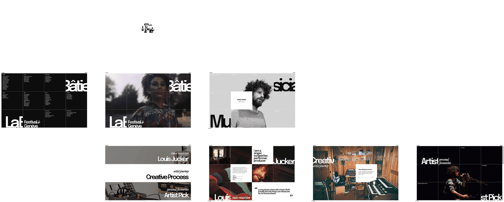
Final screens of the microsite
Conclusion
Reflection
Designing an identity that adapts across mediums
This project pushed me to think beyond creating a strong visual identity and instead consider how that identity behaves across mediums. What began as poster explorations evolved into a modular system that could extend into digital interactions. It shifted my perspective from designing static compositions to designing flexible systems, where structure, not individual visuals, defines consistency.
Meaningful discovery requires thoughtful curation
One of the challenging parts was deciding what content truly matters. With so many artists and performances, it became less about showing everything and more about shaping how users discover and connect. This process made me realize that impactful design isn’t just about visual expression, but about guiding attention and creating moments of connection. It reinforced the importance of using both content and interaction intentionally to support a more engaging and memorable experience.